Building the New openHAB Website
Let me start by saying a word about this new blog: this post is going to break away from announcements invariably made by Kai 😄 - in fact, it's not even about home automation at all... and that's fine! This space is also for you, the community, and is aimed at providing a new front-and-center communication tool besides community.openhab.org (opens new window) for anything openHAB-related which might be worthwhile or interesting to share. There is an easy-to-use editor to help guests write content even if they don't have a GitHub account or aren't familiar with Git; so if you want to contribute a post, just get in touch and we'll make it happen!
I'm thrilled to kickstart this new influx of content by giving you an overview of this new website, how it's done (I'll try to keep it interesting if you're not into web development!) and how it came to be.
# Choosing the right tool
The discussion started in February among the openHAB Foundation members and was originally about a website redesign for the main home page, to give openHAB a fresh and modern appeal to newcomers. It quickly evolved into a debate about which kinds of web technologies to use - there are indeed many possible approaches these days:
- Pages rendered by a server using technologies like PHP or servlets (openHAB's Basic UI or traditional CMS like WordPress or Joomla are examples of this architecture). Having dynamic client-side features are possible with this approach but need to be added on top with another JavaScript framework and/or plugins;
- A Single Page Application or SPA where most or all of the rendering is done in the browser using a modern web application framework like Angular, React or Vue.js - for example, GMail, Paper UI and HABPanel are SPAs. These feel usually very snappy and "app-like", not requiring page reloads, and allow more dynamic and interactive features... but they're not optimal for websites because they doesn't play well with search engines, since the initial page is an empty shell until the JavaScript app is fully loaded (Google and others can interpret JavaScript when indexing now, but it's still kind of hit-and-miss);
- To solve the above problem, modern web frameworks now all offer isomorphic or server-side rendering (SSR), allowing the initial page load to be rendered on a backend Node.js server and also boot the JavaScript app (often a SPA) client-side, by the same framework, using the same shared code. The drawback is that it requires that backend server to keep running in order to serve the pages dynamically;
- A static site generator like Hugo (opens new window), Hexo (opens new window) or Jekyll (opens new window), the latter being used in GitHub Pages powering the venerable docs.openhab.org (opens new window) and the former website, prebuilds all pages from markup and templates; these are great for content-centric websites like documentation, load fast since nothing is dynamically-rendered, and don't require any kind of backend application server so they can be hosted on a content delivery network (CDN);
- A relatively new trend is to combine both advantages of a server-less static site generators and isomorphic rendering by prerendering all pages as static files with the initial content at build time with the SSR capability of a web framework, and load the same web framework on the client to take over once the page is loaded to allow dynamic web app components and single-page navigation. This is implemented by Next.js (opens new window), Nuxt.js (opens new window) or Gatsby (opens new window), among others.
Then, about one month and a half ago, as we were discussing Nuxt, I learned about VuePress (opens new window) and suggested considering it as well.

VuePress was started just a few weeks before by Evan You, the Vue.js project founder, with the intent to create a simple new generator for their own subprojects' documentation. Despite being literally days old, it was already gaining traction and popularity very quickly, and rightly so: it has a great responsive default theme for technical documentation - you might recognize it here since only minor modifications were made - as well as a good feature set with convincing advantages (opens new window) over the abovementioned alternatives. Most interestingly, it seemed it could easily allow killing two birds with one stone: being able to give openHAB a modern new "marketing" front, and easily giving the documentation pages' a fresh look in the process too, improving the navigation and giving them the new coat of paint they needed - all with the same tool.
I was immediately convinced and hacked together a proof-of-concept in a few hours to check whether it could handle the 400+ pages of the sizeable openHAB documentation... and it actually went very well. The go-ahead came shortly after: the new website was going to be built with VuePress.
# Migrating (or not) the documentation
The openHAB documentation has its own repository (opens new window), with a carefully crafted process to gather them from about half a dozen other repositories - Eclipse SmartHome, openHAB 1 & 2 addons, and repositories for specific add-ons or integrations like the Z-Wave binding or the Alexa skill - to be combined into a single site, which is far from trivial and no small feat. It was out of the question to disrupt this process (while it's not perfect, it works, and will be made better (opens new window)) to accomodate the new website. Instead, my approach was to take the content out of the openhab-docs repository as is, keeping the documentation workflow oblivious of the website, and manipulate it to include it in VuePress as a separate subsequent step - improvements and streamlining of this resulting 2-step process would be made afterwards.
This is the purpose of the prepare-docs (opens new window) script, run as part of every build before the actual compile phase generating the web app and static files: this script clones the docs repository in a temporary location, moves the content into the final structure, removes Jekyll-specific things, fixes some links & content, and takes care of incompatibilities between Jekyll's and VuePress' Markdown renderers; it also determines the original location of the documents (for valid Edit on GitHub links to the source), and adds logos & deprecation warnings to pages, among other things. Finally, it enumerates the add-on pages by type, creating files included by the main config file in order to build the sidebar navigation.
All this migrated and generated content is not checked in the website's repository (using directives in .gitignore files) to avoid duplicates and outdated content. This is why the documentation is not actually being migrated: it continues to be maintained separately in its own repository, keeping its own existing issues and pull requests trackers, and is simply prepared and included into the website during the build. Over time, some of the more specific find & replaces in the prepare-docs script tackling a specific problem with some page will be eventually fixed at the source and removed.
# Combining Markdown rendering & Vue.js components
One of the great strengths of VuePress is that it allows leveraging Vue.js by either taking over the whole layout of a page, like the home page or the blog, or rather embedding components inside Markdown content, giving pages some dynamic features where needed, like on the Download and Add-ons pages.
Vue.js is certainly one of the most trending web app frameworks today, and like its competitors it includes a component system where pages are a composition of increasingly specialized, self-contained components (opens new window). For example, the source of the home page (opens new window) is basically a stack of sub-components, one for each section - making it trivial to move them around or inserting a new one -, and those sections may also in turn include other components (like the animated icons in the "Why openHAB" section or the Twitter timeline).
I have only months of experience with Vue, but what I like the most about it is the ability to combine the markup template, styling and scripting of a component inside a single .vue file, while keeping the three aspects separate - each Component.vue file has a distinct <template> section, a <style> section and a <script> section. It's a very clean design, and the syntax is concise too: for example, a popular feature of this website is the Showcase & How-tos page, and the component behind it (opens new window) is not that complex really - if you take out the styling, it's actually only 15 lines of markup and about 30 lines of scripting.
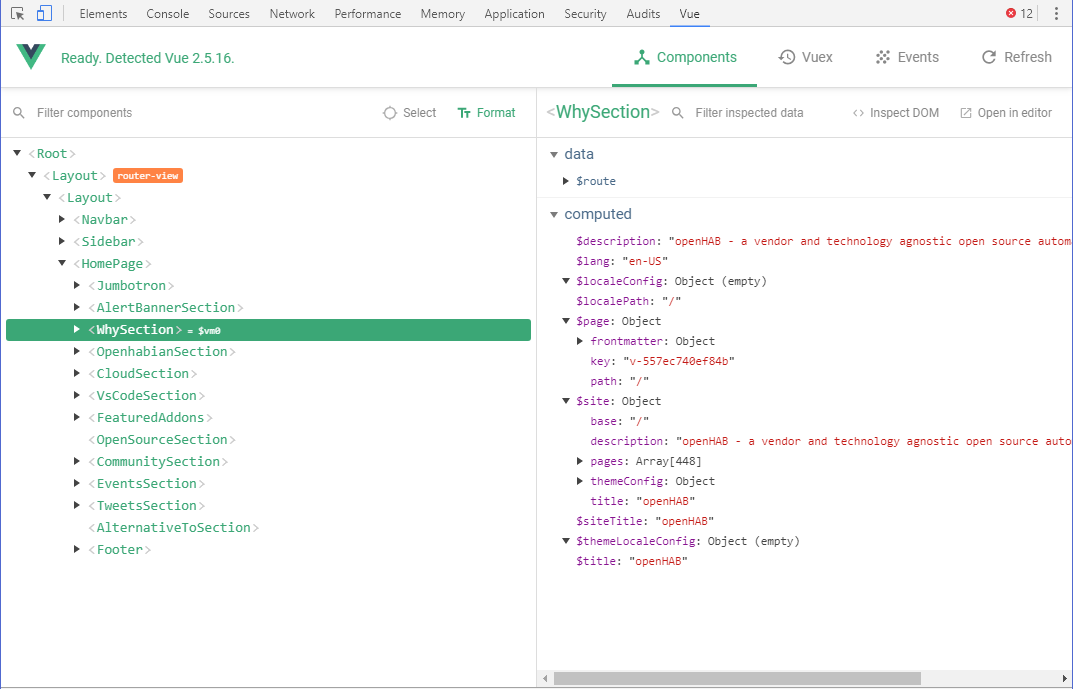
There's also a great devtools extension to help figuring out what's happening while you're developing:

Worth mentioning is, VuePress makes the metadata (including "front matter") on all the pages of the site available to all components: this makes it easy to filter and manipulate collections of pages - the blog post index (opens new window), add-ons browser (opens new window) or even the event list (opens new window) (which is not a component but simply v-for (opens new window) loops in the actual page) rely on this ability.
# Optimizing for navigation performance
Thanks to various new techniques, the performance of modern web frameworks has improved a great deal in the last generation, and Vue.js already produces applications which are very fast on their own.
As mentioned before, all pages are pre-rendered in two versions: first, a full static page, so that when you initially land on a particular page, its actual content will already be there as pre-rendered HTML, providing fast initial loading and giving search engine bots something to index. When you navigate away from that first page with a Javascript-capable browser though, Vue.js running on the client will download another version of the new page's content, a small .js file - a webpack bundle technically -, and execute it to replace only the relevant area.
On top of that, browsers are nowadays expected to be fairly up-to-date, and they pack all kinds of more of less recent technologies which all come into play with this new website to give you the best possible navigation experience.
One of them is resource hinting (opens new window): when you land on one of the site's pages, meta tags will inform your browser of both essential styles and scripts to preload early with high priority, but also tell it to prefetch the text of all the pages of the site, meaning it will schedule them to load with the lowest priority (basically when idle (opens new window) - it can also choose not to prefetch at all) won't immediately execute them, just keep them handy in case they're needed.
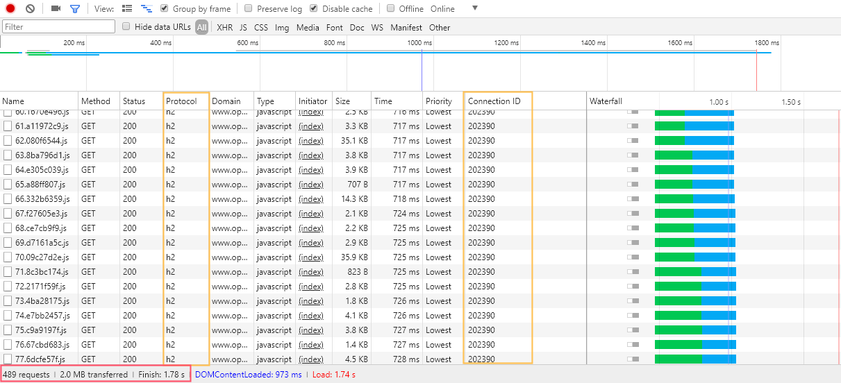
That's right: the whole text of every page on the site is potentially loaded in the background by your browser, when it deems it appropriate, to speed up navigation. That's why on supported browsers (opens new window), switching between pages seems nearly instantaneous. Since the site has 480 bundles or so (as a result of about 450 pages), this means each of these 480 bundles will be prefetched by the browser! You might ask, is it a good idea? A few years ago, this would have been crazy indeed, but here's how it actually performs on my pretty average DSL connection:

I've highlighted what's noteworthy in the screenshot above; first, take a look at the status bar: since the textual content of the pages is highly compressible, and Gzip compression is enabled, the whole website (all 450 pages of it excluding images) amounts to a mere 2 MB download... pretty acceptable these days. Just try loading your average newspaper website's home page and monitor how much you download - 2 MB are not a lot 😉.
Almost five hundred HTTP requests though, for each visit, won't all these requests crush the servers? And how does it all happen in less than 2 seconds? Here's the trick: the "h2" in the "protocol" column above means the site is using HTTP/2 (opens new window), which has been approved as a standard in 2015, and which virtually every browser (opens new window) supports now. And HTTP/2 has request and response multiplexing (opens new window), therefore not only it reuses the same underlying TCP connection for all requests (see how they have the same Connection ID in the screenshot above), but requests-responses pairs are also not necessarily in sequence but can be handled concurrently, and may arrive out of order.
Akamai's site on HTTP/2 (opens new window) gives a fairly good overview of the protocol's benefits; especially check out the demo (opens new window) - if you open the developer tools Network tab while testing it, you'll notice all HTTP/1.1 requests are made and received sequentially, while HTTP/2 requests are happening in parallel and received in any order.
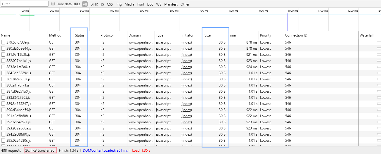
Combined with other features like header compression, it makes the background prefetching of those 480 files a matter of seconds; chances are, it's finished before you navigate away from the first page. And even if it's not, since you're not refreshing the page - remember, the application is a SPA - it's going to continue in the background when the browser is idle, while the assets needed to actually render the next page will always take priority. Plus, since they're static files, they're put in the browser cache, saving it from having to download them in full again. This means subsequent page loads are even quicker since it only has to check whether the cached versions are still up-to-date:
 Small HTTP 304 responses on subsequent visits, indicating the files have not been modified and telling the browser it may reuse the version it has cached
 # New hosting and continuous deployments
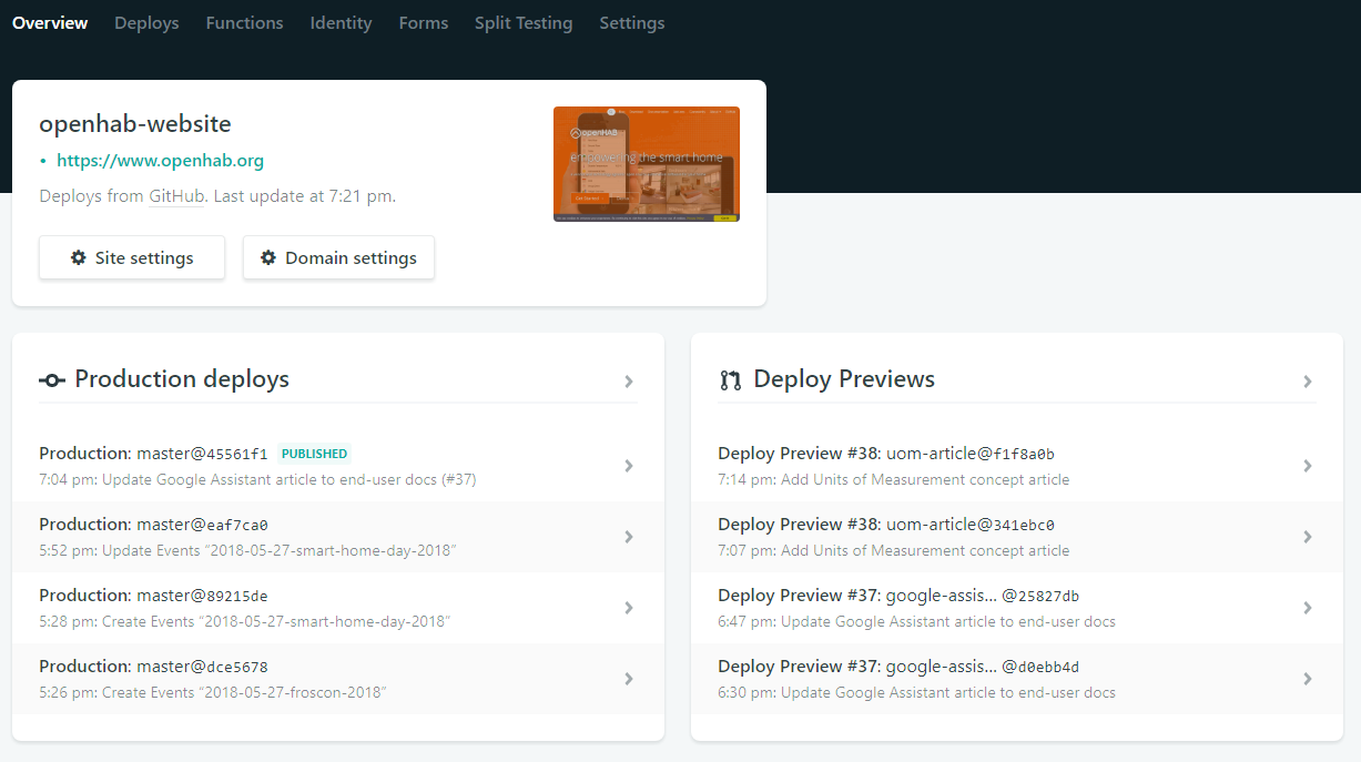
With the switch to the new web stack, we've also changed our hosting platform and are now using Netlify (opens new window), giving far more control over the deployment than GitHub pages (which by the way will still continue hosting docs.openhab.org (opens new window) for a while!).

A critically useful benefit is to permit running custom scripts, most importantly the prepare-docs script described above, as part of the continous integration build and deployment. Here's what a typical build output looks like (opens new window).
Also nice is the ability to see the end result of every pull request and commit with deploy previews, each being given its own URL and linked in the relevant GitHub pages. A free Let's Encrypt (opens new window) certificate for the openhab.org domain for is managed automatically and its renewal every 3 months is taken care of without intervention.
We've also adopted their CMS tool for static sites and Git, Netlify CMS (opens new window), for selected parts on the website (blog posts and events), to allow adding this types of content with a user-friendly UI and without requiring a GitHub account. It works great with VuePress generated pages. If you want to get access to contribute, just contact the openHAB Foundation; regular pull requests to the openhab/website repository (opens new window) are also possible and appreciated!
# Conclusion
I hope you'll enjoy the new website, and that you'll see it as a step in the right direction, making openHAB more appealing to new potential users currently looking for a smart home automation platform, as well as being more friendly to veterans while looking up info in the documentation.
There is still work to do, like re-introducing full-text search, fixing the remaining broken links and simplifying the documentation gathering process - if you have further ideas or want to help, feel free to chime in in the forums or on GitHub!
